As the new strategic aims for the National Trust started to appear and the new agency, 18 Feet and Rising, began to start showing associated marketing material for 2013's campaign, it became apparent among the internal team of designers that the graphic design lacked quality, and needed some help.
The device that forms the new direction, and helps form the core of the new brand campaign is called I Oak Leaf. It helps represent love for our places (and others), giving personal meaning to the locations that our visitors appreciate and have connections with. It's visual appearance apes that of the original I ❤ NY campaign design by Milton Glaser, where the Trust's oak leaf becomes the heart.
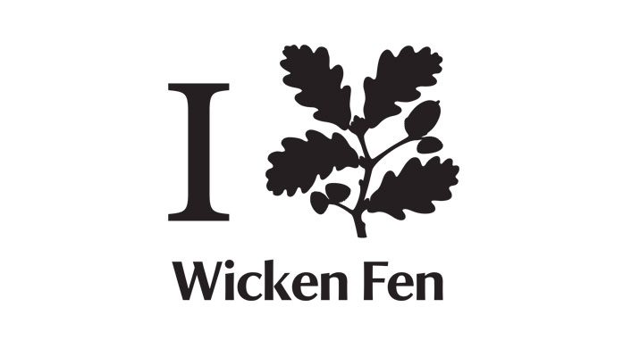
One of the modified instances of 18 Feet's lock-up, after we had an initial stab at improving how the lock-up should look.
While the graphic design of the I Oak Leaf lock-up doesn't match exactly that of the original 70s New York campaign, it retains its essence.
However, 18 Feet's initial graphical approach was one that seemed to lack finesse, regardless of how close (or not) it should be to the original. Having seen that approach, it was decided to challenge its quality and improve how it worked with the wealth of National Trust places that would likely use it.
What we challenged with
A quite thorough approach was taken with figuring out how best to weight and the 'I' and the oak leaf between themselves, and alongside various place names and the like.
Some detailed work was done to figure out how best to present the 'I', as the National Trust's typeface didn't have a capital 'I' that fitted 18 Feet's original idea (or the essence of the New York version). A combination of Bodoni (for the serifs) and the stem of the NT's 'I', with its curved edges, came together to make an 'I' that had more class than merely using a conventional serif version.
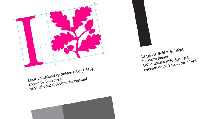
The golden ratio in all its 1.618 glory.
The golden ratio was brought in to help align the 'I' and the oak leaf and also used to set the type beneath proportionally. This meant the lock-up would work extremely well alongside any type set beneath it, and in isolation.
The importance of making sure this lock-up worked anywhere and with any associated typesetting was paramount. The sheer wealth of combinations and applications meant it had to work seamlessly.
It's something I think we achieved with our first challenge, but as we found out on presentation to 18 Feet, it wasn't the forgone conclusion we were thinking it would be.
What we presented first
Take a look at the first document we put together. It shows our thinking and the direction the work took to reach what we thought was a good middle ground. It retained the essence of what 18 Feet had put forward, but would work across harder multiple uses than their first iteration of the lock-up.
After the meeting
Unfortunately the meeting didn't go particularly well, but all parties learned something from it. 18 Feet, had had the chance to come prepared after viewing our first stab before the meeting. This was helpful as they clearly had realised they needed to put more thought into their approach. However, what was demonstrated was felt to be a little like an afterthought – only created in response to our efforts. Who knows whether they would ever have been pro-active enough to have produced that under their own steam...
Calm down, move on, start the next stage
We persevered though, and set about re-working our lock-up to meet 18 Feet's more in the middle than previously. As they seemed reticent to take onboard some of our suggestions, we agreed between ourselves to keep tinkering with ours to improve it and make sure it worked across those pesky smaller ad formats.
This second, and final stage, would refine our lock-up and demonstrate it working effectively with small print and digital ads. We think it does this and you can see the results in the PDF.
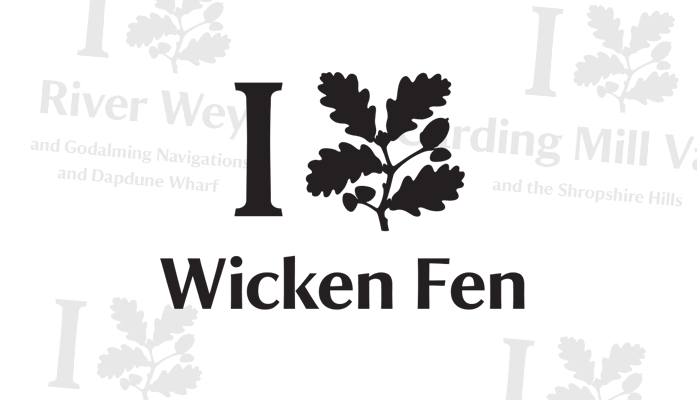
Wicken Fen in our lock-up. The faint background shows other combinations – see the PDF for detail.
We even took the opportunity to demonstrate how 18 Feet's own approach (based on the rules they explained their lock-up should use) would work. This was to show, politely, how it didn't always work as effectively in comparison with our approach. During this stage of work, our own lock-up was pushed away from its initial construction, increasing the size of the oak leaf in comparison to the 'I', but maintaining the golden ratio set-up we were working against. This was our attempt to better what we'd done and meet 18 Feet in the middle – somewhere still useful to the campaign and all parties concerned.
Additionally, a further document was produced that showed how well our version of the lock-up worked with various ad sizes and combinations of place names – a critical part of our offer, that short or long place names can be accommodated within one lock-up.
Mostly the end
Even this level of detail didn't seem to help. 18 Feet were adamant about sticking to their version, and were reluctant to change course after listening to well put arguments by key members of internal staff, and the wealth of work we'd brought to the table.
Unfortunately, it was mostly sidelined, but as you'll see from the next section, we did learn something from the whole escapade.
What we learned
There can be a lot of egos around when working with creative/brand/advertising/marketing agencies. You have to be careful about how you approach criticism and relations on projects.
A few assumptions were made on our part about how well our work would be received. We were quickly proved wrong, but we think it was partly to do with how we did it. 18 Feet's presence on the new campaign is mostly in part to them pitching for the work with that very idea, and like any creative, they're passionate about it not being contaminated by others and want to see it through from start to finish as they see fit.
In essence, we were treading on their work and invading their space. We may not have done that in the right way, in hindsight, but we were right in trying to improve what was being made because of what it will mean to the organisation. It had to work better than their initial approach, as they had little idea of the complexities involved in producing templates for set ads and other formats, for instance. And ultimately it would be the organisation and its many places that had to work with it, not experienced marketers or graphic designers.
This appreciation of how the lock-up should work across more than just a glamorous 48-sheet billboard, has been the driving force in improving its direction. Regardless of whether our internal approach is taken (there's alway hope, right?) they have improved the quality of what they are creating.